The 3 Sections Your Portfolio Website Needs To Win More Clients
Your portfolio website does not have to be super flashy or fancy to win clients over. These 3 essential sections can woo clients.
Over the last couple of years of my career as a designer I have gone through many iterations of my portfolio website. I can still remember to this day how hard I worked and all the time I put into coding my first website just before graduating school. I thought it was so important to have a portfolio website that was similar to a big agency’s. A portfolio website with a big flashy logo and an organized grid of my work but I couldn’t have been more wrong.
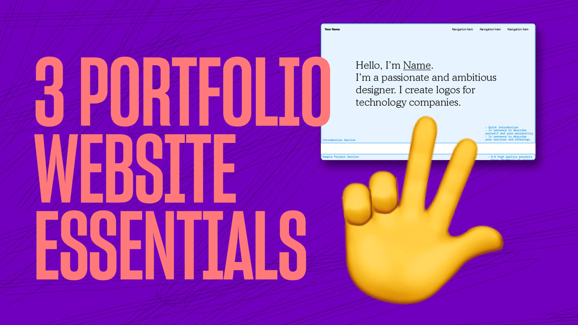
The three essential sections you need on your portfolio website to more clients are an introduction section, a selection of your favorite projects and a contact section. As I’ve grown in the creative industry and worked my way up to a lead design position. I finally feel that I’ve found a simple portfolio website structure that results in consistently having clients get in contact with me for projects.
These three pieces are essential to have on your portfolio website to attract more clients. You can absolutely add more detailed sections if you would like but these three are the minimum for what you should have on your portfolio website.
My experience hiring creatives based on their websites
Before I go into detail about each essential piece, I have actually been on the opposite side of the table and hired creatives based on their portfolio website before. In the last two years working as a designer for a major brand I have had to hire both freelancers and agencies. The first thing that always drew me in when looking to hire was their portfolio website. Of course there are other considerations that come into the picture during the hiring process but your portfolio website is the absolute most important first impression.
What portfolio websites were the most effective?
The portfolio websites that were most effective and resulted in an interview or call with freelancers were websites that conveyed a sense of personality and perspective. Now you might ask yourself, “How might I accomplish those two things?”.
Personality can take shape in the form of color choices or the fonts that you choose. We go into more detail in this article about building a winning portfolio for the creative industry here.
Perspective is something that can be conveyed in the type of work you choose to display on your portfolio website. I like to think of perspective as a way to understand your style and creative preferences when producing work.
My personal portfolio website
As I mentioned before I have gone through many countless iterations of my portfolio website and the one that I currently have had for the last 2 years has been super effective for attracting clients. The very first section when you go to my portfolio website is a quick 2 sentence introduction about myself as a designer that also includes a self-portrait image. After is a section that includes all my favorite projects and finally at the bottom there is a section that contains my contact information.
If you’re thinking to yourself, “wow that is so simply”, then yes you are correct. The old fashion saying ‘Keep It Simple Stupid’ is very much so something that I apply to portfolio website.
The importance of an introduction section
An introduction section at the top of your portfolio website is super important to differentiate yourself from your competition and also lets clients know you are not just another person behind a screen. Working in the creative industry involves serving clients and establishing a relationship with them. The keyword is relationship.
An introduction section can also save you from clients you shouldn’t work with. This might sound weird, but there are clients out there that you shouldn’t work for because they can cause more aggravation than the project is worth. An introduction section can help to thwart off customers that do not fit into your ideal project.
What should you include in your introduction section?
The first thing you should include in your introduction section is a short description of you and what you offer clients. Keep it short and sweet (2–5 sentences). For me, that includes 1 sentence describing qualities about myself and 1 sentence describing what I can offer clients.
Example:
I’m Jon. A dreamer, problem solver, and most of all, a people person. I help jumpstart direct to consumer brands.
In my first sentence I listed dreamer, problem solver, and people person because I believe these are my best qualities and why clients enjoy working with me. The second sentence relates to the type of projects I enjoy working on and what I can do for them.
Self-portrait photo of yourself
Also included in my introduction section is a self-portrait that I had professionally taken. I do this because I believe it helps clients understand that I am not just another designer working behind a screen to pump out quick work.
How to create your introduction section
Create a list of 30–40 words that describe your personality.
Make two shorter lists:
Be as specific as possible. This will help set client expectations and avoid scope creep.
Selected projects section
After the introduction, the next section should be 4–6 of your highest quality projects.
Guidelines:
Only show the work you want more of.
Minimum of 4 projects, maximum of 6.
Avoid including filler projects just to bulk up the section.
How do you select your projects?
Tell a story – each project should have a beginning (problem), middle (work), and end (result).
Use enough images – mockups, flat graphics, or photos depending on your field. You can find resources at DesignCuts.
Be proud of the work – it should be work you can talk about confidently.
What should you do if you don’t have enough projects?
If you’re just starting out:
3 projects that meet the guidelines is acceptable.
If you only have 2, create a 3rd self-initiated project to round it out.
Personal projects can help you explore new interests (that’s how Wellfed started).
Contact information
The final essential piece is the contact section. At minimum, include:
Name
Email
Phone (optional)
A simple email link is often enough. A form is optional.
Give something away
Differentiate yourself by offering something small and useful to potential clients:
Designers: a typography guide
Illustrators: a color palette
Photographers: a free preset
This can encourage newsletter sign-ups and faster client contact.
Conclusion
Your portfolio website doesn’t need to be complicated. Keep it simple:
Introduction
4–6 projects
Contact section
If you have questions about your current portfolio website you can sign up for a 1-on-1 creative session. Sessions are 30 minutes and we can review your portfolio together.
You can also get a free portfolio website homepage outline by signing up for our newsletter below. This outline gives you a loose framework to see how simple your portfolio website can be so you don’t overthink it.