
Best Adobe Portfolio Themes for Graphic Designers (2026): How to Pick the Right One Fast
The wrong Adobe Portfolio theme wastes hours. Here are the 5 best themes for graphic designers — what each one is built for, which work type fits each layout, and how to decide in minutes.
The single biggest time-waster I see designers encounter with Adobe Portfolio isn't the platform itself — it's picking the wrong theme and spending hours trying to make it work before starting over.
Adobe Portfolio offers a selection of themes across two distinct layout groups. Most of them aren't worth your time. A few of them are genuinely excellent — if you match them to the right type of work.
This guide cuts straight to the five themes worth considering, explains exactly what each one is built for, and gives you a clear framework for choosing in minutes rather than hours. I've spent significant time inside Adobe Portfolio — I've built with it, taught it, and watched hundreds of designers navigate it. These are the recommendations I give every designer who asks.
A quick note on terminology: Adobe Portfolio calls these "themes" inside the platform, though many designers search for "Adobe Portfolio templates" — they're the same thing. This guide covers both.
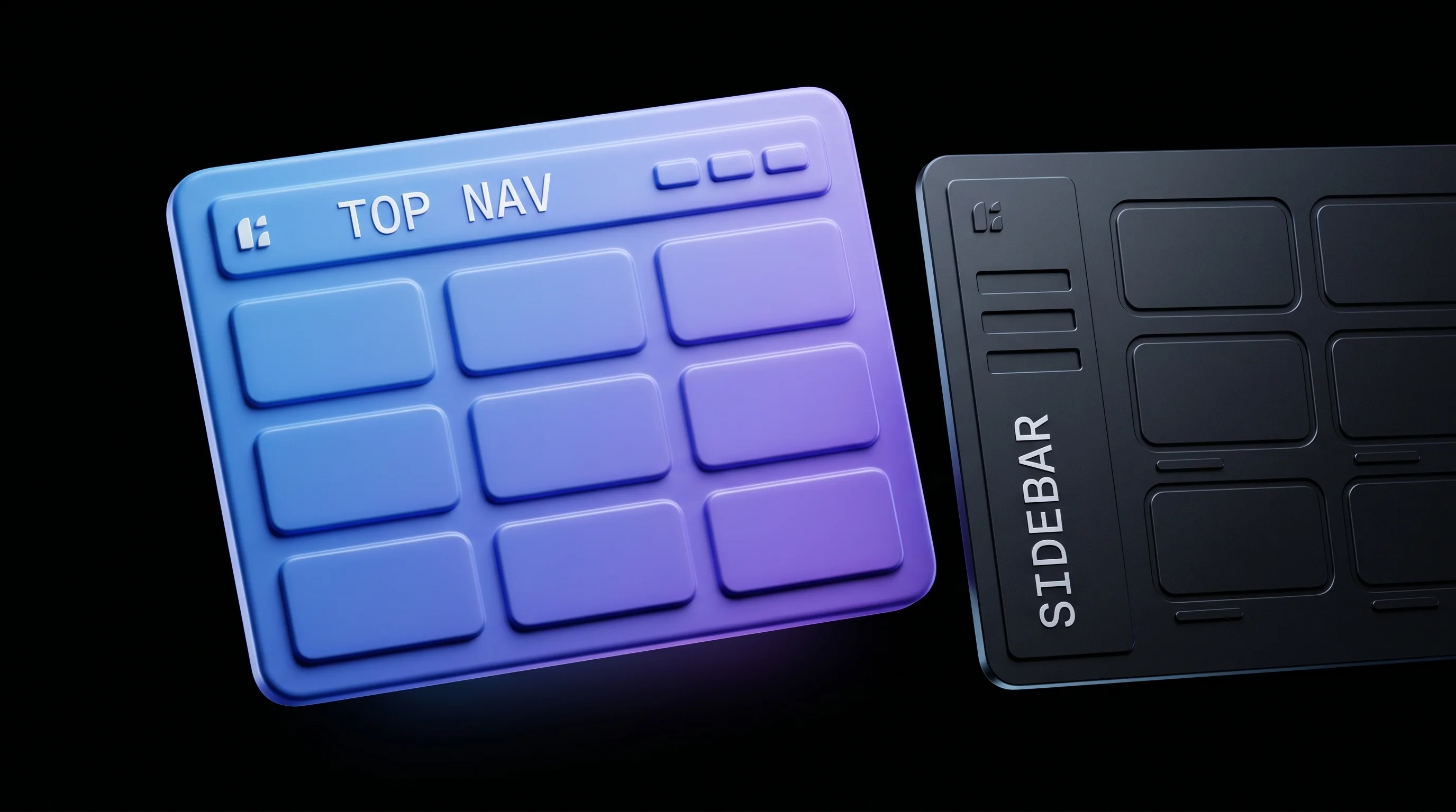
Understanding Adobe Portfolio's Theme Groups
Before getting into specific recommendations, it helps to understand how Adobe Portfolio's themes are organized — because this alone narrows the decision significantly.
Adobe Portfolio themes fall into two structural groups:
Group 1 — Top navigation, content below. The navigation bar spans the width of the browser at the top, with your portfolio grid filling the page below. This is the current standard in web design and where visitor attention naturally flows. All five of my recommended themes fall into this group.
Group 2 — Left sidebar navigation, content on the right. This layout was popular around 2015–2016 and shows its age. The sidebar navigation competes visually with your work rather than framing it, and the overall structure feels dated compared to what designers and clients expect from a professional portfolio in 2026.
My recommendation: stay entirely within Group 1. The themes below are all top-navigation layouts that give your work the space it deserves.
Within Group 1, the themes differ in four ways that matter for your decision:
- Thumbnail aspect ratio — how your project images are cropped in the grid
- Navigation structure — how your site name, pages, and social links are arranged
- Grid density — how many projects display per row and how much space surrounds them
- Typography defaults — how titles and labels are presented alongside your work
Understanding these four variables makes the choice straightforward.
The 5 Best Adobe Portfolio Themes for Graphic Designers
1. Thomas — Best Overall Starting Theme
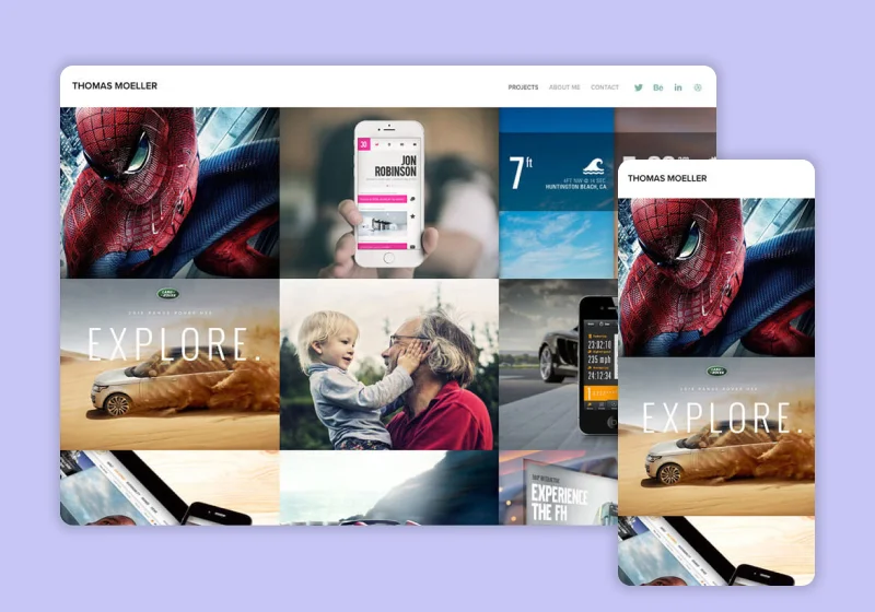
Thumbnail ratio: 4:3 — landscape format, versatile across most work types Navigation: Clean top bar, site name left-aligned Best for: Brand identity, packaging, print, multi-discipline designers
Thomas is my first recommendation for most graphic designers starting out on Adobe Portfolio — and looking at the examples post, it's the most-used theme among the strongest portfolios on the platform for good reason.
The 4:3 thumbnail ratio is forgiving. Most design work — brand identity presentations, packaging mockups, poster designs, editorial layouts — fits naturally into a horizontal landscape format without awkward cropping. The grid fills the page in a tiled layout that gives each project equal visual weight, letting your work establish hierarchy rather than the template doing it for you.
The navigation is simple and stays out of the way. Site name on the left, your pages across the top, nothing on the right competing for attention. For designers who want the focus entirely on the work — which should be most designers — Thomas delivers that cleanly.
Choose Thomas if: You work across multiple disciplines, your projects are primarily horizontal in format, or you're unsure which theme to start with. It's the most forgiving theme on the platform and the one that requires the least adjustment to make work well.
Watch out for: Vertical work — if your primary output is portrait-format designs like posters, album covers, or mobile app screens, the 4:3 ratio will crop them in ways that don't show them at their best. In that case, look at Hegen.
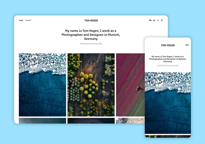
2. Ludwig — Best for Designers with Horizontal Presentation Work
Thumbnail ratio: 16:9 — widescreen format Navigation: Three-section bar — pages left, site name center, social links right Best for: UI/UX designers, web designers, motion designers, presentation-heavy work
Ludwig uses a 16:9 widescreen thumbnail ratio — the same format as most screens, most presentation slides, and most mockup templates. If your work naturally lives in widescreen format — website designs, app interfaces, presentation decks, motion graphics stills — Ludwig shows it without any cropping adjustment needed.
The three-part navigation is distinctive: your pages on the left, your name or logo centered, your social profile links on the right. It creates a balanced, intentional header that reads as more considered than a simple left-aligned nav. One important note: if you don't add social profile links, the right side of the navigation appears empty. Make sure you have at least one or two social links to add before using this theme, or the header will feel unfinished.
Choose Ludwig if: Your work is primarily screen-based — UI/UX, web design, app design, motion graphics — and your project images are already in 16:9 or widescreen format. The theme will show your work exactly as it's framed without any recomposition.
Watch out for: The empty right navigation if you don't have social links to add. This is the most common issue designers run into with Ludwig and it's worth knowing before you commit to the theme.
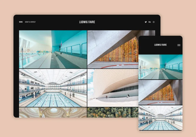
3. Hegen — Best for Print Designers and Illustrators
Thumbnail ratio: Vertical / portrait format Navigation: Similar to Ludwig — three-section top bar Best for: Poster designers, album cover designers, book cover designers, illustrators, fashion designers
Hegen is structurally similar to Ludwig in navigation and overall layout, with one significant difference: it uses a vertical thumbnail format rather than the landscape ratios of Thomas, Ludwig, and Marta. This makes it the right choice for designers whose primary work is portrait-oriented.
Music poster designers, album cover artists, book cover designers, fashion illustrators, editorial illustrators — anyone whose work naturally exists in a taller-than-wide format will find Hegen shows their projects more faithfully than any other theme on the platform. The vertical grid creates a rhythm that feels intentional rather than awkward, which is exactly what portrait-format work needs.
Choose Hegen if: A significant portion of your portfolio consists of vertical or portrait-format designs. This is the theme that was built for your work type — using any of the landscape-ratio themes for primarily vertical work means either awkward cropping or thumbnails with significant padding that diminishes their impact.
Watch out for: The same empty right navigation issue as Ludwig if you're not adding social links. Same fix applies — add at least one social profile link before publishing.
4. Marta — Best for Versatility with Extra Navigation Functionality
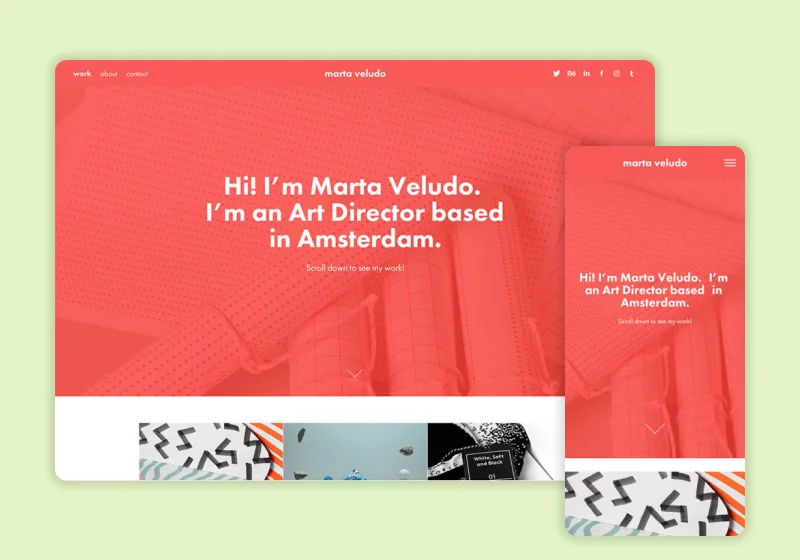
Thumbnail ratio: 4:3 — landscape format, same as Thomas Navigation: Top bar with pre-configured options for additional functionality Best for: Designers who want Thomas's layout with slightly more navigation control out of the box
Marta uses the same 4:3 thumbnail ratio as Thomas and a similar overall page structure — so if you're deciding between the two, the choice comes down to navigation preference rather than layout. Where Marta differs is in its navigation defaults: it comes pre-configured with options that give your header slightly more functionality without requiring you to dig through settings to activate them.
For designers who want a bit more control over how their navigation is structured — particularly around how services, about pages, or contact information is surfaced in the header — Marta gives you that without additional configuration. If Thomas is the clean, minimal default, Marta is the slightly more feature-ready version of the same layout.
Looking at the best Adobe Portfolio examples in the wild, Marta appears most frequently on portfolios that have strong personal branding alongside their project work — designers who want their navigation to communicate more than just "here are my projects."
Choose Marta if: You want Thomas's 4:3 grid layout but you want slightly more built-in navigation flexibility, or you plan to use your About and Services pages as significant parts of your portfolio rather than just supporting pages.
Watch out for: Over-configuring the navigation options. Marta gives you more to work with, which can tempt designers to add too much to the header. Keep it focused — your work should be the main event, not a navigation bar with six items.
5. Mercedes — Best for Illustrators and Art-Forward Designers
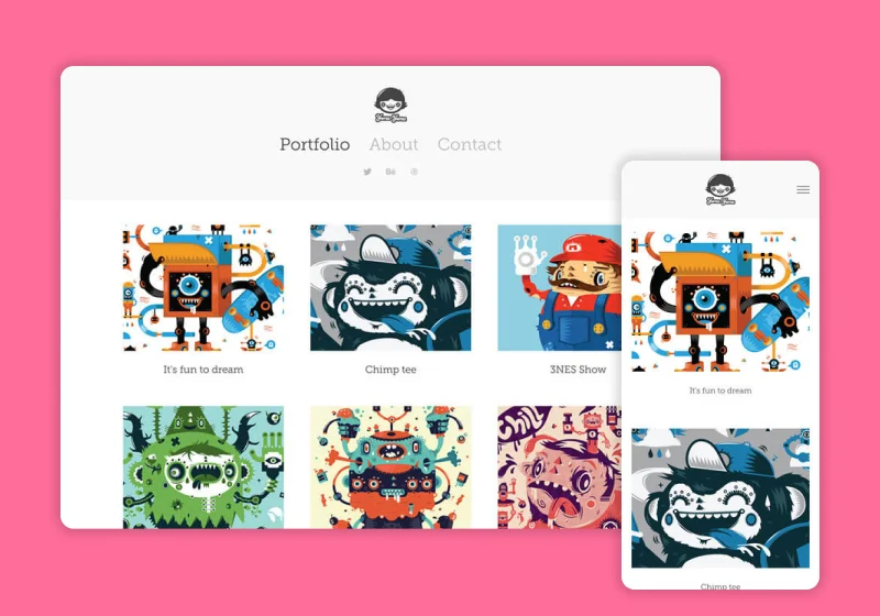
Thumbnail ratio: 4:3 — landscape format Navigation: Centered vertical stack — name on top, pages and social links below Best for: Illustrators, artists, photographers, designers with a strong personal brand identity
Mercedes is structurally different from all four themes above: instead of a horizontal top navigation bar, it uses a centered vertical stack at the top of the page — your name largest, your page links and social links stacked below it in progressively smaller type. Project titles and details display beneath each thumbnail rather than on hover.
This layout creates a more editorial, gallery-like feel that suits work where the designer's personal identity is as important as the projects themselves. Illustrators, fine artists, photographers, and designers whose visual style is immediately recognizable will find Mercedes presents their work with a sense of authorship that the other themes don't quite achieve.
The centered navigation also means the page reads differently from the others — there's a natural pause at the top before the grid begins, which gives the viewer a moment to register whose work they're looking at. For designers with strong personal brands, this is a meaningful distinction.
Choose Mercedes if: You're an illustrator, artist, or designer whose personal visual identity is central to your brand. The centered navigation frames you as the author of the work in a way the other themes don't. It also works well for photographers who want a gallery-style presentation.
Watch out for: The thumbnail titles and details displaying below each project rather than on hover. This adds visual information to the grid that can feel busy if your project titles are long. Keep titles short and descriptive — two to four words maximum — to keep the grid clean.
How to Choose the Right Theme in Under 5 Minutes
If you've read the descriptions above and you're still not sure, answer these three questions:
1. What aspect ratio is most of your work?
- Primarily landscape or square → Thomas or Marta
- Primarily widescreen / 16:9 → Ludwig
- Primarily vertical or portrait → Hegen
- Mixed or unsure → Thomas (most forgiving)
2. Do you have social profile links to add to your navigation?
- Yes → Ludwig or Hegen are fine
- No → Thomas, Marta, or Mercedes avoid the empty-nav problem
3. How central is your personal identity to your brand?
- Work-first, identity is secondary → Thomas, Ludwig, or Hegen
- Personal brand as strong as the work → Mercedes or Marta
For the majority of graphic designers starting out, the answer is Thomas. Pick it, set it up, and launch. You can always change your theme later — Adobe Portfolio makes theme switching non-destructive, so your content stays intact. The theme decision matters, but it doesn't matter as much as having your portfolio live.
What All Great Adobe Portfolio Sites Have in Common
The theme is only the starting point. Looking at the best Adobe Portfolio examples across all five themes, what separates the strong portfolios from the weak ones isn't which theme they chose — it's how they used it.
Thumbnail quality is everything. Your project grid is your first impression. Every strong Adobe Portfolio site invests in high-quality, consistently formatted thumbnail images. Consistent aspect ratios, strong compositions, professional mockups — this matters more than any theme decision.
They curate, they don't dump. The best portfolios on Adobe Portfolio show 6–10 projects maximum. Not everything the designer has ever made — the best of what they want to be hired to do more of.
Project pages go deeper than the grid. The homepage gets the click. The project page closes the conversation. Designers who invest in thorough case studies — showing process, not just finals — consistently outperform those who upload images and call it done.
Once you've picked your theme, the next step is using the features that separate strong portfolios from average ones. See 5 Adobe Portfolio features most designers miss for the setup details.
Frequently Asked Questions
What is the best Adobe Portfolio theme for graphic designers?
Thomas is the best overall starting theme for most graphic designers. It uses a forgiving 4:3 landscape thumbnail ratio that fits most work types, like brand identity, packaging, print, and editorial, and a clean top-navigation layout that keeps the focus on your work. It's the most-used theme among the strongest portfolios on the platform.
Can I change my Adobe Portfolio theme after publishing my site?
Yes. Adobe Portfolio makes theme switching non-destructive, so your content stays intact when you change themes. You can try different themes and preview how your work displays before committing to one.
Which Adobe Portfolio theme is best for vertical or portrait work?
Hegen is the only recommended theme with a vertical thumbnail format. It's the right choice for poster designers, album cover artists, book cover designers, fashion illustrators, and anyone whose primary work is portrait-oriented.
Do Adobe Portfolio themes cost extra?
No. All Adobe Portfolio themes are included with your Adobe Creative Cloud subscription at no additional cost. There are no paid themes or premium upgrades. For a plan-by-plan breakdown of what Creative Cloud itself costs in 2026, see how much Adobe Portfolio actually costs.
What is the difference between the Thomas and Marta themes?
Thomas and Marta both use the 4:3 landscape thumbnail ratio and a similar overall page structure. Marta differs in its navigation defaults, coming pre-configured with options that give the header more functionality without additional setup. Choose Thomas for a minimal default, or Marta if you want more built-in navigation flexibility.
Ready to Build?
Now that you know which theme fits your work, the next step is getting set up the right way from the start — because the theme decision is just one of several choices that will determine how fast you launch and how good the result looks.
My Adobe Portfolio mini course walks you through the entire setup process — from picking your theme to having a live, shareable portfolio — with the goal of getting you from blank page to published site within 24 hours.
Get the Adobe Portfolio mini course →
Want to see these themes in action on real designer portfolios? Check out the best Adobe Portfolio examples — with the theme used called out for each one.
Still deciding whether Adobe Portfolio is the right platform for your work? Read the full Adobe Portfolio review before committing.
Want help building this out for your site? I work with founders and small teams to get the fundamentals right, fast.
Let's talk